
The Abyssal Warming Just Gave Us a Treasure Map
I’ve spent most of this project asking whether known physical mechanisms can explain the warming we’re seeing in the abyssal ocean [1]. This time I flipped the problem around. Instead of starting with known geothermal sources and asking whether they could produce the observed warming (they didn’t because we just don’t have enough data), I started with the warming itself and worked backwards to find where the heat would have to enter the ocean, and how strong would it have to be to prove the missing heat is coming from below,
That gives us an inverse prediction map (see Figure 1).
And, that prediction is now frozen, so we can start our expedition.
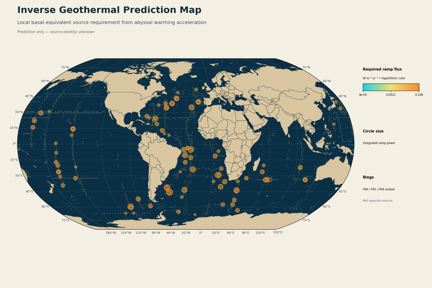
Figure 1. Inverse geothermal prediction map showing where local basal heat would need to enter the ocean to explain the observed abyssal warming acceleration. Color represents required heat flux increase, circle size represents integrated power, and nested rings mark P90, P95, and P99 regions.
Working backwards
The observational target is the warming acceleration in the deepest part of the ocean, roughly 4,000 to 6,000 dbar.
For every supported ocean column, I calculated how quickly the heat input from below would have to increase to produce the observed local temperature acceleration. I want to know how much additional heat input over time would be required to explain an accelerating temperature signal.
The basic calculation is:
Here, Vi is the volume of water represented by each observational column, and α_i is its observed temperature acceleration. Density and heat capacity convert that temperature acceleration into the amount of heat required. Then, I divided that required power increase by the seafloor area beneath each column:
So, the map is telling us something pretty specific. If the warming is being produced locally by heat entering from below, this is where that heat would need to appear and how quickly the heat flux would need to increase.
**This is still a prediction. These aren't identified geothermal sources.**
How much heat are we trying to explain?
Globally, the positive abyssal warming signal requires about 276.6 GW of additional power per year. By the end of the observational interval, that builds to about 8.32 TW of additional power associated with the positive warming burden.
The integrated energy requirement is about 4.30 × 10²¹ joules.
| Quantity | Required value |
|---|---|
| Global power increase | 2.766 × 10¹¹ W yr−1 |
| Endpoint power | 8.322 × 10¹² W |
| Integrated positive energy | 4.300 × 10²¹ J |
| Supported prediction columns | 1,417 |
| Positive prediction columns | 1,209 |
Where are the strongest features?
This is the part I was most excited to see! The required heat isn't spread evenly across the ocean. Some regions need a much stronger local heat flux increase than others. For the positive prediction columns:
0.00370 W m−2 yr−1
95th percentile
0.03318 W m−2 yr−1
99th percentile
0.05751 W m−2 yr−1
Maximum predicted local peak
0.10796 W m−2 yr−1
Here are 15 of the strongest predicted regions, ordered by their peak required heat flux increase, not by their total integrated power. The coordinates are the centroids of the broader predicted features. Click here to download the full list: all 72 features.csv
| Rank | Latitude | Longitude | Basin | Peak required flux increase | Regional required power increase |
|---|---|---|---|---|---|
| 1 | 41.08°S | 51.82°W | Atlantic | 0.10796 W m−2 yr−1 | 5.12 GW yr−1 |
| 2 | 45.50°S | 49.39°W | Atlantic | 0.09778 W m−2 yr−1 | 6.85 GW yr−1 |
| 3 | 38.25°N | 45.64°W | Atlantic | 0.08872 W m−2 yr−1 | 2.47 GW yr−1 |
| 4 | 29.27°S | 6.28°E | Atlantic | 0.07744 W m−2 yr−1 | 5.22 GW yr−1 |
| 5 | 14.25°N | 151.55°W | Pacific | 0.07441 W m−2 yr−1 | 2.07 GW yr−1 |
| 6 | 43.79°S | 30.02°E | Indian | 0.07030 W m−2 yr−1 | 3.83 GW yr−1 |
| 7 | 59.75°S | 103.72°W | Pacific | 0.06675 W m−2 yr−1 | 4.38 GW yr−1 |
| 8 | 39.75°N | 15.21°W | Atlantic | 0.06518 W m−2 yr−1 | 2.47 GW yr−1 |
| 9 | 33.75°S | 104.70°E | Indian | 0.06398 W m−2 yr−1 | 1.78 GW yr−1 |
| 10 | 26.25°S | 170.09°W | Pacific | 0.05886 W m−2 yr−1 | 1.64 GW yr−1 |
| 11 | 33.77°S | 61.93°E | Indian | 0.05835 W m−2 yr−1 | 3.79 GW yr−1 |
| 12 | 43.19°N | 41.03°W | Atlantic | 0.05794 W m−2 yr−1 | 2.27 GW yr−1 |
| 13 | 34.30°N | 51.84°W | Atlantic | 0.05758 W m−2 yr−1 | 2.52 GW yr−1 |
| 14 | 11.25°S | 1.66°E | Atlantic | 0.05673 W m−2 yr−1 | 1.58 GW yr−1 |
| 15 | 24.10°S | 22.16°W | Atlantic | 0.05555 W m−2 yr−1 | 4.56 GW yr−1 |
Ranked by peak required local heat flux increase. Regional power is integrated across the full predicted feature.
The region around 51.8°W, 41.1°S has the strongest individual required heat flux on this list, but the region around 49.4°W, 45.5°S is the largest when I integrate the required increase over the full area of the feature. That region requires about 6.85 GW of additional power per year across the feature. So "strongest local hotspot" and "largest total feature" aren't quite the same thing.
I actually like that result because it gives us two different things to look for. One region requires the most intense local source. Another requires the largest total regional source.
Hotspot hierarchy
I grouped the strongest regions using three increasingly strict thresholds: 1) P90 identifies the broader high requirement regions, 2) P95 narrows those regions down, and 3) P99 identifies the hottest cores.
Please note, a P99 core can sit inside a P95 region, which can sit inside a broader P90 region, so these aren’t separate features.
| Threshold | Predicted regions |
|---|---|
| P90 | 72 |
| P95 | 47 |
| P99 | 13 |
I’m using those levels mainly as a way to organize the search: P90 tells us where to look, P95 tells us where to look harder, and P99 tells us where the geothermal explanation is making its strongest local demands.
Now comes the fun part!
Up to this point, I deliberately haven’t used vents, ridges, crustal age, spreading rates, volcanic regions, microbial signatures, or other geological evidence to decide where these predicted hotspots should be.
That’s the whole reason I wanted to build the map first, and now the prediction is frozen, so we can go looking.
Do known hydrothermal systems appear near the predicted regions? Do the strongest predictions sit on unusual crust? Do they line up with ridge systems, fracture zones, volcanic structures, elevated heat flow, or biological signatures associated with hydrothermal activity? And, maybe more importantly, do they have anything close to the strength we need?
If the independent geology starts landing in the places the inverse calculation predicted, that gets interesting very quickly.
If it doesn’t, then a simple local geothermal explanation gets much harder to defend.
And, there’s still another possibility I’m testing separately. The heat source might not need to sit directly underneath the warming if ocean circulation can transport geothermal heat away from where it enters. That’s what my heat tracer calculation is for. So, this inverse map doesn’t close the geothermal mechanism.
It gives us something I like a lot more than another story. A prediction we can actually go test.
References
[1] Johnson, G. C. (2026). Observed Multi Decadal Acceleration of Globally Averaged Abyssal Ocean Warming. Geophysical Research Letters. https://doi.org/10.1029/2026GL124104
